MFA candidates in the Studio Art program work alongside faculty, visiting artists and art professionals to create a series of group shows, which are displayed at 80 Washington Square East.
with:
Carly Burnell
Billy Jacobs
Chris Albert Lee
Kaushani Patel
Eric Santoscoy-McKillip
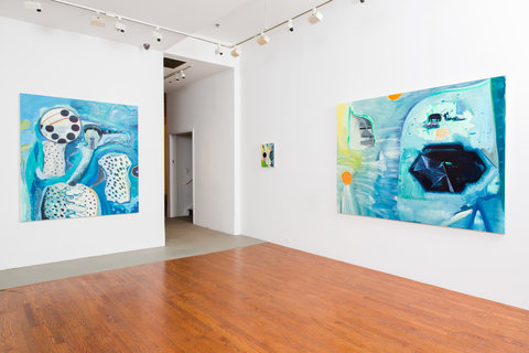
We all know the term “painter’s painter,” a reference to a practice that investigates a rarified space of painting that largely eschews content, that derives from the literalization of the surface of a painting, with its rejection of illusionistic space and other tropes of representation, and that instrumentalizes self-reflexive dimensions of painting to invite sustained retinal engagement and mental reflection. Right at the crux of these concerns is monochrome painting—a “take-no-prisoners” position in painting with a big pedigree in the annals of autonomous abstraction.
What sorts of experience can monochrome-type painting engender today? This, among other concerns, is under investigation in Carly’s studio. Her surfaces are sophisticated, with layers of paint, wax, color, and brushwork built up to produce complex surfaces that don’t give themselves over to the viewer at first glance. Translucent layers sandwich gestures—could they be fully-fledged forms? —that we are able to apprehend as “trace” or as “becoming.” We explore the potential of these paintings to sustain leaps into the domain of pure imagination and affect, to support chains of associations as ephemeral as the layers of the paintings themselves. In this sense, the paintings promise a journey of sorts, one aroused by the possibility of “interiority” that seems folded into the layered fields of their surfaces.
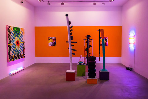
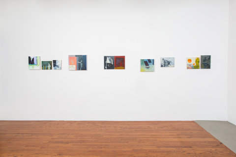
Billy is a painter through and through, and his practice extends to drawing, printmaking, and collage. Shifts of scale and materiality, ply and amp up the range of color and composition and prompt some of his painterly forms into a type of legibility that can be seen as distinctly figural or architectural. There is tension between forms/motifs we can “name” and those that elude naming. This fundamental instability gives life to several activities in Billy’s paintings. Is it a landscape? An interior? A couple of figures? The indeterminacy of motifs opens a yawning gap where associations arise and are immediate suspect, where narrativity is always fragmented, and where nothing is a sure thing. Given this, viewers might easily “over-determine” content. Something is pronounced here—a kind of swampy aesthetic espionage emerges!
To say that Billy’s paintings are “informed” verges an understatement. Quotation devices crowd the frames of reference of these paintings. One dominant aesthetic is situated in post-War German painting. It hosts references to early Baselitz and Polke circa 1960’s and 70’s, and Kippenberger and Oehlen circa 1980’s and ‘90s. Belgian painters figure here as well—Rene Daniels and Luc Tuymans. Philip Guston moves in and out of these spaces, too. One senses this could go and on, the activity of “locating” the work.
Unpacking the history of post-War painting has barely begun. These paintings insist on the legitimacy of retrospective energy. We find ourselves on the cusp of a digital revolution whose impact is still brand-new. How that might figure into the meditations occasioned by Billy’s paintings is part of the “future perfect” the work configures. As Robert Smithson once remarked, ‘it’s the future going backward.”
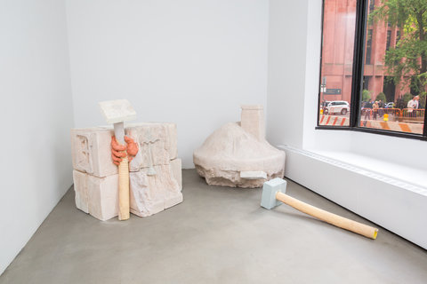
Simplicity and humbleness announce themselves immediately in Chris’ work.
Styrofoam is a primary building material. Carved, glued, polychromed--it would
seem its primary attribute is either mutability or artifice. In addition to being itself, in Chris’s studio it presents as something in addition to that: as architectural shelves and/or facades; as giant carvings, or huge “Flintstone” truck wheels. It offers instant monumentality. The sense of “surplus” circulates throughout Chris’s practice. Production values are not high. Nothing looks precious or extremely valuable. That’s probably a function of the materials, but it extends to iconography that’s gentle and fun. Flowers and faces accompany architectural friezes; a hand pops out of a painting’s surface and gives a welcoming “hello” gesture. A cartoon sensibility informs the imagery—mined, I would say, as much from popular culture as from Modern painting. Philip Guston is in there and so is Carroll Dunham, with the exception that Chris’s paintings don’t have any menace. The mental space indexical to his work is both critically engaged with various histories of art and culture—Romanesque art anyone? —but keeps its mannerisms mild. The palette of the work is a case in point—a lot of the color looks dry and translucent, like sidewalk chalk on cement. The work extends beyond the sculptures I’ve referenced—I saw them in the Broadway Windows, and then again in pieces in the studio. There are also paintings that host inquiries and seem to have the potential to explore media space and masculine identity. What unites it all is Chris’s protean curiosity. He’s out to discover the world, no less!
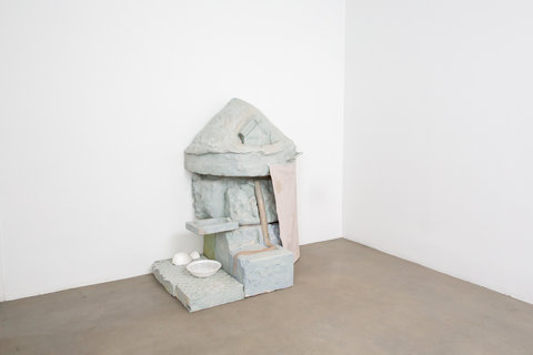
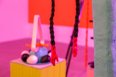
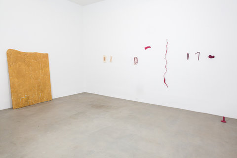
Materiality is everything in Kaushani’s studio practice. First, there is literal texture, pigment, shape, and goop as well as lots of different varieties of stuff. The materiality alone suggests the potential for a kind of contemporary alchemy. There is also a sense of struggle to achieve expressive form. The process tends to be administered in a deliberately heavy-handed manner, as though it has been labored over. Force. Push. Cut. Like Richard Serra’s “Verb List.” But to identify the processes that inform her practice would get at only a part of Kaushani’s work. She was not raised in the traditions of Western Art. An Indian artist—not that she wants that identity necessarily—raised in India, not particularly knowledgeable about Western artists, whose work seems aligned in a formal sense, nonetheless, with aspects of post-Minimalism. There is an emphasis on degraded materiality and there are efforts to de-familiarize materials so that their “origins” remain in question. Behind it all lies the possibility of quiet reminiscences—they involve family life back home, her mother’s life in particular, and her own individuation. At least we imagine so. How the mother made things—that’s a universe!
Extreme materiality, emphasis on process and transformation of everyday materials into something “other.” That’s where the navigation devices in the work open wide. Personal reflections on the difference—between here and there. That’s at least two continents' worth of investigation.
.jpg)
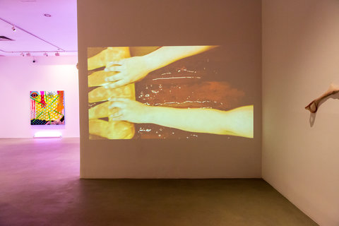
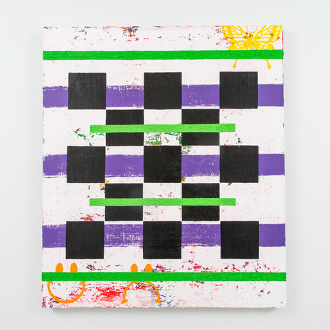
Eric activates a veritable battery of cultural motifs of the sort that proliferate in bodegas and around neighborhood corners, but that also circulate in high Modernist culture, and occasionally reference ancient civilizations, too. The “fusion aesthetics” describe an enriched contemporary sensibility closely associated with what might be termed, expansively, as “border culture” which in itself is inherently hybridized. Eric’s palette is specific to the hybridized variants of Mexican and Chicano cultures, and certainly other “micro-cultural” references that would be familiar to the locals of South/West Texas, one of the geographical locators for the work. And yet, the audience for whom Eric makes work isn’t local. The cultural appropriations that abound in Eric’s practice are fashioned to be both celebratory and critical and would seem, in part, to pack distance between the visual information that circulates “back home” and the art world for which the work is intended.
Eric pushes the “borderland” aesthetic to engage a variety of frames of reference. Within a gallery setting in New York or an NYU studio in the West Village, the loud colors are delivered as excess. The “South of the Border” motifs mobilize cultural stereotypes that preserve difference but don’t necessarily valorize diversity. At the same time, the work insists on recognition of modernist Mexican artists, such as Tina Modotti, whose photographs occasionally function as sources of inspiration for the work.
His excessively bright “Southern” palette is matched with surfaces that speak about urban stucco walls as palimpsests of vernacular experience. The idea of the “street” reverberates throughout the work, in color and texture, form and imagery. We may not know the particulars of the many cultural references Eric wields, but their general familiarity is a testament to the pervasive power of advertising that long ago mobilized cultural icons in the service of product lines. Who owns culture? Who claims the right to advance the signification of cultural icons? The ideas of “South of the Border” that animate Eric’s art are tangled with the conundrums of globalization. Colonization, advertising, branding, cultural identity, authenticity, and class—these crowd the agenda of his work.