I have always thought of Stand Up Comedy (b. 2007, Portland, Oregon) as a container. And this container would hold ideas representative of daily life, expressed through styles, labor, and a very small portion of culture as it influences our world. The minute aspect is emphasized, as the specificity of the focus is a way to engage productively with more dominant forces. It is a way to bring some kind of order to a continuous nagging feeling of disquiet that people who are interested in such things often experience. This feeling is sometimes distressing, mostly pleasurable, and always distracting.
The store is not comprehensive in its interpretation of what is happening now. But through our trust in the designers and artists who’ve been foundational to this SUC way of thinking, we’ve attempted to de-center some of the established order of how to look and what to see. These individuals have helped to further refine our container, keeping its boundaries fluid, and energetic. No ideal form of a shop exists, but we try to hold the raindrops in our hands, to give those instincts a home to land, and scatter.
—Diana Kim, Stand Up Comedy
With:
69
Bless
pelican avenue
IKO IKO/Kristin Dickson-Okuda
O-R-G
Flint Jamison
Scott Ponik
Julie Peeters
Alec Marchant
Organized by Stand Up Comedy.
Commissioned by Howie Chen. Produced by Jon Huron, 80WSE.
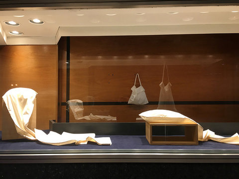
* Broadway Windows gallery is a series of five street-level display windows located at the corner of Broadway and East 10th Street. The installations can be viewed 24 hours a day, seven days a week.
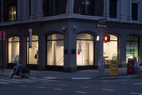
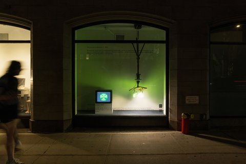
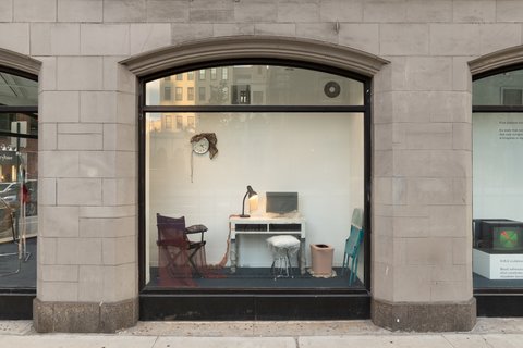
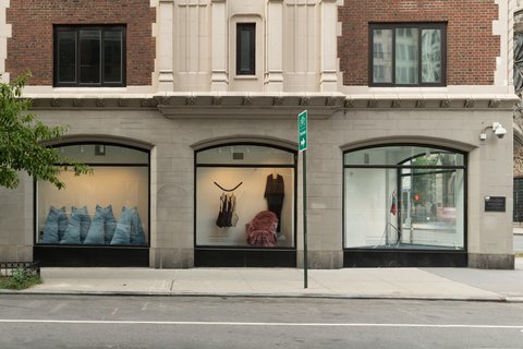
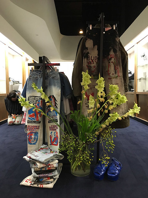
Installation view
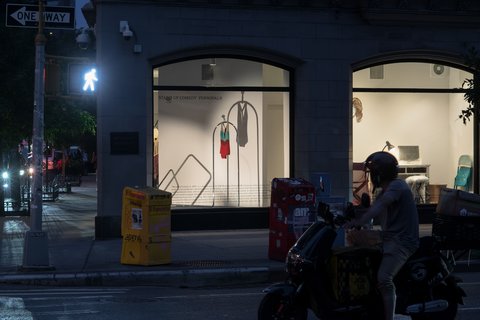
pelican avenue
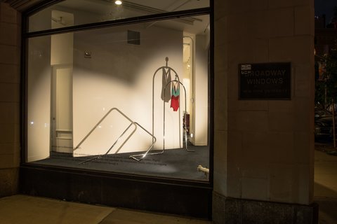
pelican avenue
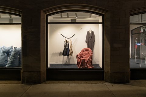
Bless
O-R-G (left) and Flint Jamison (right)
69
IKO IKO/Kristin Dickson-Okuda
Installation view
Come Tees (CA) greets you at the store entrance on this wintery day in 2016. Rose Mackey, our then manager, is wearing a pair of the now legendary jeans. What you don’t see is the baby crawling beneath the clothing rack as Rose smiles beatifically. This day is distinct because it is during the busy holiday season and a crew of shoplifters attempted to make off with the featured merchandise.
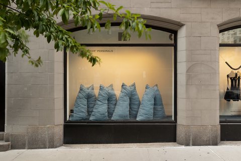
Rowena Sartin/Iko Iko (CA) makes their Stand Up Comedy window debut (2016) with a series of home-referencing objects, namely, all manner of pillowcases made with luxurious crushed silk and utilitarian muslins. Extra long and exaggerated or converted into peplum bags, they mash up utilitarian and decorative ideas, useful or beautiful or both.
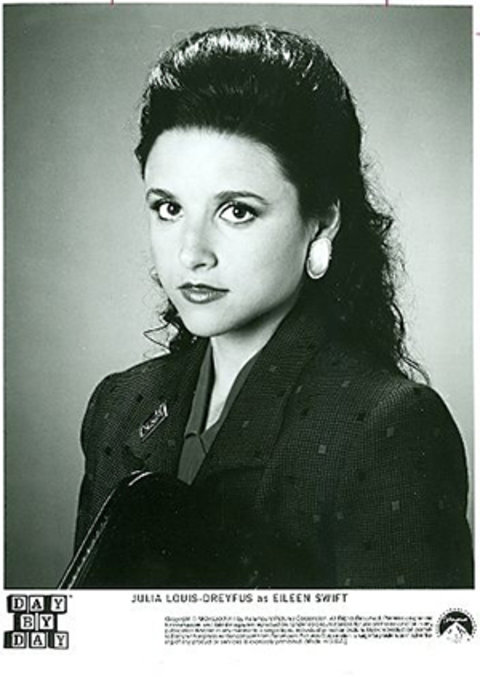
A headshot of Julia Louis-Dreyfus from one of her lesser known roles, Eileen Swift from the sitcom Day by Day (1988). This image was used by us in 2018 because Louis-Dreyfus is an actor who has been an inspirational figure to the store, starring in an objectively tedious show, that is related to a formative one (Family Ties), and a ubiquitous production company whose theme is permanently seared into the subconscious (sit Ubu sit; good dog).
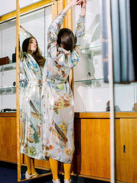
Anntian’s Silver Food dress (2019), a piece regretfully missing from the Stand Up Comedy archive. If you are lucky enough to procure this one, keep it. Shot by Mindy Byrd, styled by Pauline Kim, worn by Jessica, the model who dislikes modeling and is therefore always honest in her looks.
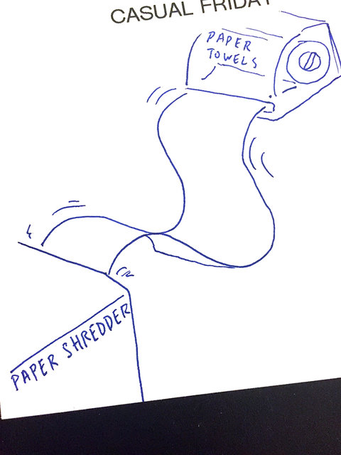
SUC Clip Art (2018) for a “casual Fridays” themed newsletter, aimed at convincing subscribers that office wear should be as expressive as weekend attire.
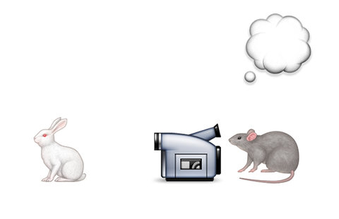
SUC Clip Art (2015) for an email newsletter. A rat films a rabbit through a camcorder, while an empty cloud bubble hangs over the scene. An early work commissioned from the clip artist, who will go on to create many more memorable and head scratching images for the store.

SUC Clip Art (2016) for an email newsletter touches on themes important to the store, namely pleasure (wine), effort (tornado), work (edits), and vice (lipstick). All linked, all life, all the time.
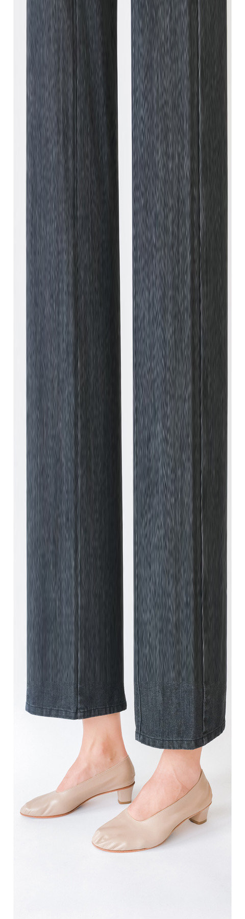
This image from 2017 features the classic Martiniano High Glove shoe, which has been a staple for many years in the store. The image is shot by Melissa Doran and Honey Owens, and manipulated by Scott Ponik for an email newsletter. The purpose of the email is to promote newly marked down styles. Mr. Ponik designed the newsletter with an enticement to access these lower prices at the top, and invites the receiver to scroll to the bottom where a link is offered to reap the reward.
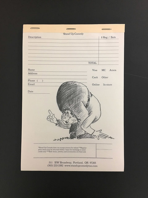
Stand Up Comedy relocates from the east side of Portland to its current downtown location in 2015. Shortly thereafter, it retires the analog sales system of handwritten carbon sales receipts. A charming, labor intensive and error-ridden system that requires many printed materials. Every employee at the store has horrible handwriting.
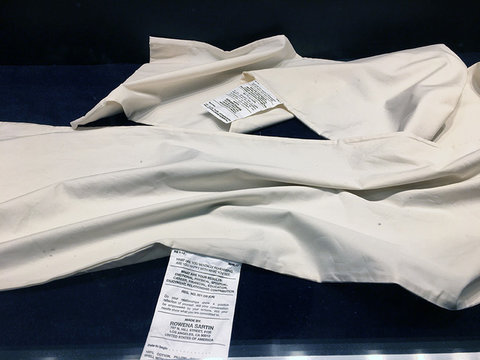
A close up image of the tags attached to the pillowcase objects made by Rowena Sartin/Iko Iko for the Stand Up Comedy windows (2016). A replica of the long, often confounding tags one finds attached to bed linens and mattresses, the artist uses this space to share thoughts on the internal questions one might ask while at rest(lessness).
Build out begins at Stand Up Comedy’s new 511 SW Broadway (2014) location after lease signing. A nearly 6-month process that sees the birth of a child, the move of a home, and the start of a new chapter for a small, family business.
In spring 2017, the Stand Up Comedy window displays video work by Mae Elvis Kaufman for designer Suzanne Rae. The piece satirizes 80s daytime television aimed at women and their supposed interests, and presciently, the birth of multilevel marketing. All featuring Ms. Rae’s popular Feminist Kimono dress.
In 2016, Stand Up Comedy closed its original Indexhibit website (shopstandingup.us) and launched standupcomedytoo.com. This new site, designed by Scott Ponik, retains much of the same DNA in its feeling of analog uselessness.
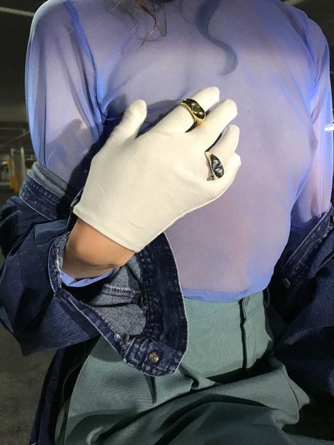
Rings by Leigh Miller are worn with gloves that could be identified as used by jewelers, worn by majorettes, or deployed by mimes. Shot by Melissa Doran and Honey Owens in 2017.
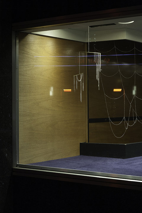
The Stand Up Comedy window features an installation by the jeweler Samma (2017). Delicate chains are hung to balance between shadow and light, emphasizing negative space through patterning and materiality. Photo by Melanie Flood.
Holiday decorations celebrating winter 2017 adorn the shop’s normally stark security gates. Floral designer Manu Torres is tasked with creating a harmonious seasonal message that is beautiful to view without being sentimental.
Commissioned for its opening in 2007, A-Frame signage options hand-lettered by designer/typographer Karl Nawrot.
Select SUC Newsletters (2008-2012):
In the spirit of the Whole Earth Catalog, prepared as a holiday special, with captions and photography reflecting the cadence and look of the iconic original (2008). An early edition of a newsletter system that would be designed on the Stand Up Comedy letterhead.
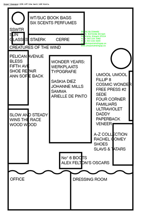
Way finding for our original one-room, 180 square foot space, showing the location of every brand and object in the store (2008).
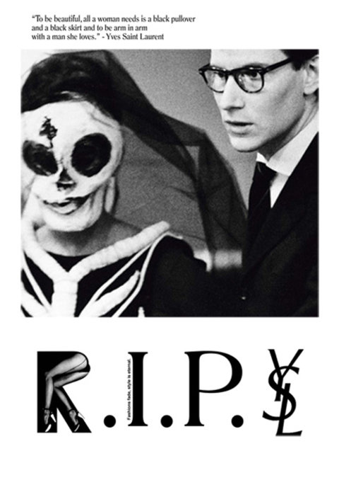
Upon the passing of Yves Saint Laurent (2008).
All selections that emphasize misreading, with a special emphasis on architect Michael Graves’s maligned Portland Building. Featured designers were included in a second newsletter sent the following day (2008).
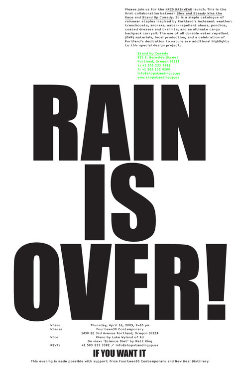
Created to advertise the Stand Up Comedy/Slow and Steady Wins the Race rain wear collaboration (2009). The pianist Luke Wyland, in addition to his own compositions, was tasked with playing the theme from television series The Office for as long as it was tolerated.
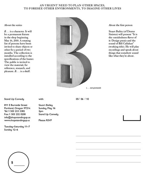
Moving into a new format, the newsletter is now designed as part of a system of collateral allowing one document to serve as stationary, gift certificate, price tag, postcard, and letterhead. The “B” is a shelf built to house a rotating mix of books and objects selected by persons invited to do so by SUC (2010). Inaugurated by Stuart Bailey.
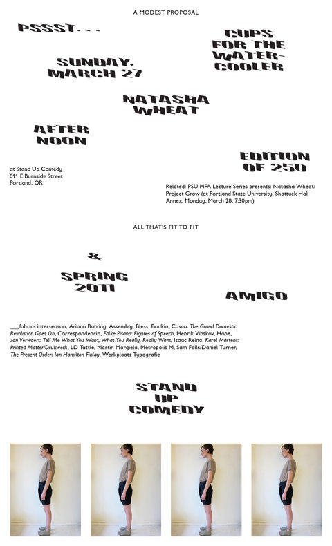
“B” features a stand in by the SUC water cooler, with water cups designed by artist Natasha Wheat (2011).
As summer approaches, the notorious pacific northwest June gloom is highlighted and scorned (2011).
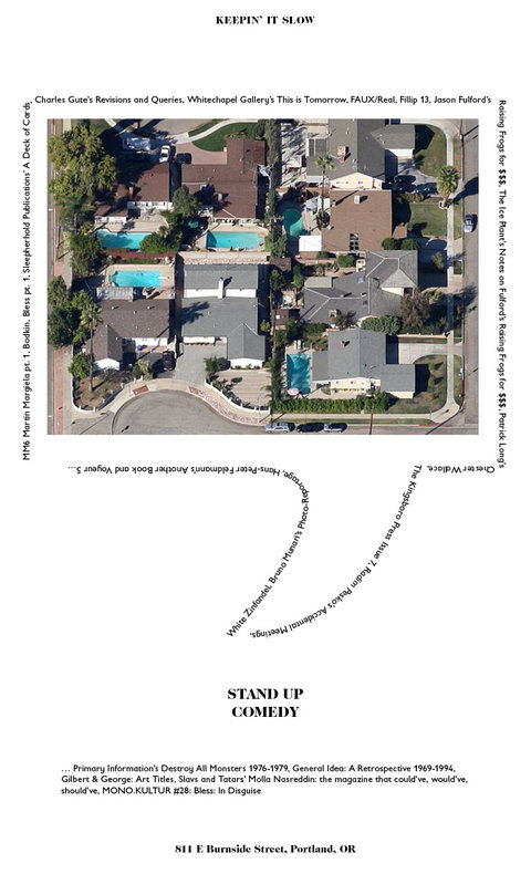
As summer winds down, we reflect on thoughts of pools and heat and suburban cul de sacs (2011). An example of continuous, possibly opaque narratives through communications.
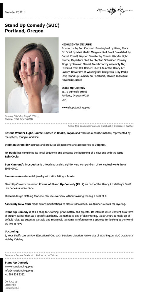
An early example of presenting information using templates already established by various entities. This one may have been from Resumes for Dummies. Also serving as an anti-announcement that SUC did not have a social media presence, as the directives to Facebook/Delicious/Twitter lead to nowhere (2011).
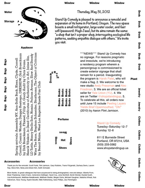
Another take on a store map, and announcement of the second expansion of the store which allowed for an elaborate, zig zag entrance to the dressing room that required no door or curtain (2012).